by
Dr Stephen J Nash | Oct 24, 2012
OECD data has recently highlighted that Australia has a risky pension system, even though it maintains a large pension system relative to GDP.
Recently, the Organization for Economic Cooperation and Development (OECD) issued some information on OECD asset allocations and the size of pension funds, relative to the GDP of a country. In this article we:
- Review the size of the Australian pension system, relative to GDP
- Look at the OECD data for asset allocation, among OECD countries
- Simulate the risk and return of a selection of OECD countries using a set of simplifying assumptions
We argued recently, that we expect low growth for longer, and this is consisted with the forecasts being made by the official sector (they have been accurate over many years). Market participants have a habit of expecting too much growth, and then of being disappointed, so that markets have effectively experienced a period of continual disappointment, since the global financial crisis began. In many ways, Australian asset allocation will be shown to exemplify this tendency of expecting too much and then being disappointed, through relatively high allocations to risk assets. Effectively, Australians are arguing that they can have high risk allocations, because they are “different”, or they are “special” and this article questions this argument, while also arguing that the swashbuckling investor is an odd coupling to the cautious consumer.
Pension system relative to GDP
As the data from the OECD indicates, Australia has a large pension system, relative to the size of GDP, at around 92.8% of GDP (see Figure 1), relative to a weighted average of 72.4%, and a simple average of 33.9%. While Australia sits forth on the table based on total assets to GDP, it ranks first for equities as a proportion of total assets, as shown in Figure 2. The possibility of the pension system transmitting risk to the broader financial system is also large (1).
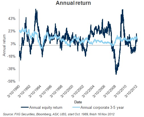
Source: OECD, Pension Markets in Focus, September 2012, Issue 9, Figure 3
Figure 1
Weighting to equities highest in OECD
As Figure 2 shows, Australia has the highest allocation to equities in the OECD, and close to the lowest allocation to bonds. As will be shown later, this means that Australia leads the world in terms of taking financial risk in a large pension system. One would have thought that this is not the most prudent investment allocation, as it exposes Australia to the vagaries of financial market pricing, especially in the most volatile asset class; equities.
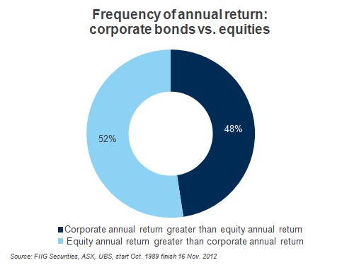
Source: OECD, Pension Markets in Focus, September 2012, Issue 9, Figure 14 (2)
Figure 2
Simulated risk and return
If we use domestic data, with three domestic asset classes, then we can estimate the risk and return characteristics of various countries. Specifically, one can use the following three asset classes and indices to estimate portfolio returns and risks, from 3 October 1989 to 27 September 2012, using daily data:
- Fixed income - UBS Australia Composite Fixed Income Index (0+yrs.)
- Equities - All Ordinaries Accumulation Index
- Cash - UBS Bank Bill Index
In Table 1 we compare portfolio allocations by country. The countries selected have economies similar to the Australian economy, or have large pension systems like Australia, or have large bond allocations, unlike Australia.
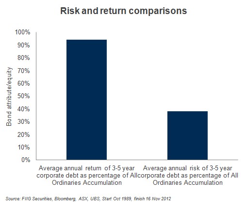
Source: FIIG Securities, OECD, Pension Markets in Focus, September 2012, Issue 9, Figure 14,ASX, UBS, Bloomberg
Table 1
Now, we allocate “other” equally to all the other asset classes, so that the allocation between the three main asset classes becomes clearer as shown in Table 2.
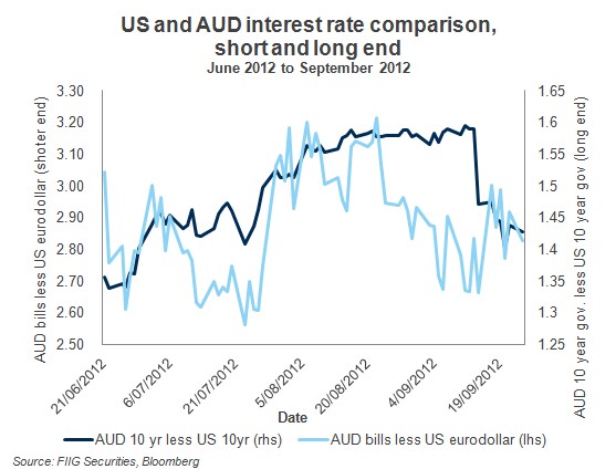
Source: FIIG Securities, OECD, Pension Markets in Focus, September 2012, Issue 9, Figure 14, ASX, UBS, Bloomberg
Table 2
Given these allocations, the risk and return of the selected countries pension systems can be estimated in Table 3.
Source: FIIG Securities, OECD, Pension Markets in Focus, September 2012, Issue 9, Figure 14, ASX, UBS, Bloomberg
Table 3
Notice how the Australian risk estimate is substantially higher than the other selected countries, while return is lower. These results will be portrayed more effectively in Figure 3 below. With the highest allocation to equities in the OECD, it is logical that the risk of the Australian pension system should be the highest. While no global diversification is allowed for in the analysis, the idea is to obtain a broad measure of how various asset allocations would have performed in the Australian context.
Putting it all together
Given these allocations, we can estimate what each portfolio would have performed like, in terms of risk and return for the period specified, as well as indicate the relative size of the pension system through the use of bubbles, so that the larger the bubble, the larger the size of the pension system, relative to GDP.
Source: FIIG Securities, OECD, Pension Markets in Focus, September 2012, Issue 9, Figure 3, Figure 14, ASX, Bloomberg, UBS)
Figure 3
When we look at the summary results, in terms of the ratio of annual return to annual risk, Australia fairs poorly. While leading the OECD in risk taking, Australia also has one of the lowest ratios of return to risk. As we have said many times, more bonds allow the portfolio to cut risk, and thereby boost the ratio of return to risk, without materially impacting return.
Such an acceptance of risk seems to be completely inconsistent with the conservatism of the consumer, which is evident in the elevated savings rate, as mentioned in much of the recent RBA commentary. While consumer conservatism is preventing the consumer from taking on more debt as rates fall, the Australian pension system remains resistant to accepting the change in the tone of the consumer. However, a cautious consumption pattern will, at some point we hope, translate into a more cautious portfolio investment allocation.
Conclusion
While caution stalks the Australian consumer, preventing them from taking on debt as rates fall, Australian superannuation funds are still back in the “old days”, taking an aggressive stance with a high allocation to equities. While Chinese growth has explained part of this inconsistency, between the cautious consumer and the swashbuckling investor, the recent moderation in Chinese growth makes that explanation less convincing. Indeed, moderations in Chinese growth have already struck government financing, in the form of the Mid Year Economic and Fiscal Outlook (MYEFO) released on 22 October, though are yet to strike the Australian investor. The size of our pension funds as a proportion of GDP and the relative over allocation to equities means we are over exposing our savings to unnecessary risk.
(1)
1. Data refer to the first trend calculations for the year 2011
2. Data refers to the end of June 2011
3. The figure for total assets at the end of 2011 is an early estimate based on the 2010 level of assets and the flow of transactions in 2011. It does not take into account value changes. A 2011 final estimate will be available in January 2013
4. Source: IAPF Pension Investment Survey
5. Source: Bank of Japan
6. Data refer only to pension funds supervised by the Securities Market Agency of Slovenia
7. Data for occupational pension plans refer to 2010
8. Data refer to PERCO plans as of June 2011 (source: AFG)
(2)
1. The "Other" category includes loans, land and buildings, unallocated insurance contracts, hedge funds, private equity funds, structured products other mutual funds (i.e. not invested in cash, bills and bonds, shares or land and buildings) and other investments
2. Source: Australian Bureau of Statistics. The high value for the "Other" category is driven mainly by net equity of pension life office reserves (15% of total investment)
3. Other investments include market or fair value of derivatives held
4. The high value for the "Other" category is driven mainly by other mutual funds (14% of total investment)5. Other investments include derivatives at market value and outstanding accounts against plan sponsors
6. Other investments include foreign issued by entities located abroad
7. The high value for the "Other" category is driven mainly by unallocated insurance contracts (22% of total investment).
8. Source: Bank of Japan. The high value for the "Other" category is driven mainly by accounts payable and receivable (25% of total investment) and outward investments in securities (20% of total investment).
9. The high value for the "Other" category is driven mainly by other mutual funds (18% of total investment)
10. The high value for the "Other" category is driven mainly by unallocated insurance contracts (31% of total investment)