This article assesses three indicators of relative value for shares and concludes that while the Australian market is overvalued it is still better relative value than the US market.
“Favour substance over form. It doesn't matter if an investment is public or private, fractional or full ownership, or in debt, preferred shares, or common equity”, Warren Buffett.
In the 2015 Smart Income Report we wrote about the relative value of various equities, credit and government bond markets around the world. At the time we showed a chart illustrating the view that:
- Government bonds around the world were far above historic averages, no doubt the result of years of QE.
- Corporate bonds were around long-term averages, slightly better than average prices in the US and looking like poor value in Europe.
- Equities on the other hand were looking expensive in the US and at historic values for the EU and Australia.
Since then, there has been further rises in equity prices in Australia, the US and Europe. US equity prices have only been at these levels three previous times: 1929, 1996-99 and 2007; preceding the three largest share market corrections in history. But before these corrections, there were still plenty of opportunities to profit – the 1996-99 period saw near 50% more upside before the eventual correction for example.
And that’s the point of using historic ratios: they are only an indication of when risk of a correction is rising.
Below we outline three indicators of equity market risk and show that the US market continues to break new records, but the earnings growth simply doesn’t justify the departure from history. Australia shows some signs of overpricing, but certainly not to the extremes the US is experiencing.
Equities – three indicators of relative value
1. Long-term PE ratio (Shiller cyclically adjusted PE ratio)
This is one of the most common measures used to assess future returns, as the market has a history of repeatedly “mean reverting” (mean reverting simply means “returning to its average”, that is if the ratio has risen well above its long-term average, it has tended to fall back to the long-term average).
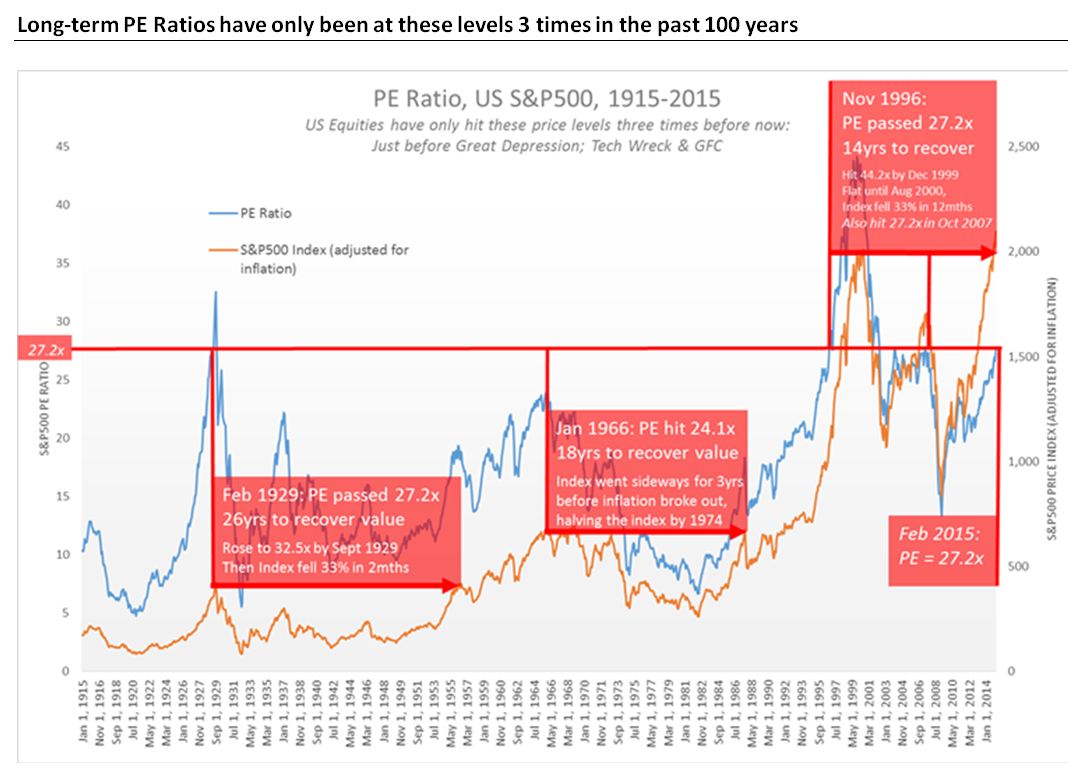
US equities have only been at their current PE ratio* three times in the past 100 years, as shown by the blue line in the chart below: 1929, 1996 and stayed above until 1999 and 2007. In each case, the market kept going up very strongly, but crashed suddenly shortly after.
Australian equities data doesn’t have as long a history, so this measure isn’t as robust, but at current levels the ASX200 is trading at a premium of 24% to its long-term average.
 Source: Yale University
Key points to note include:
1. The red vertical lines show the previous times that the S&P500 has been at these price earning (PE) ratio levels.
2. The red horizontal arrows show how long it took after the market correction before real values recovered to the peak before the correction.
3. Great Depression correction:
a. PE ratio passed 27.2x in Feb 1929
b. Prices kept rising until Sept 1929, then collapsed 33% in two months, kicking
off the Great Depression
c. It was 1955 (26yrs) before they recovered to the same real value
4. 1966 peak:
a. Wasn’t 27.2x in this case it was just 24.1x
b. Took 18 years to recover – inflation eating most of the value in this time
5. Tech Bubble peak:
a. PE passed 27.2x in Nov 1996
b. Prices rose another 33% after this, taking 3 years to hit their peak
c. But then fell sharply (Tech Wreck), and took until Nov 2014 to recover real
price levels
6. GFC peak:
a. During the period it took to recover from 1999 peak, PE ratios hit 27.2 again in
Oct 2007
b. 12 months later the market corrected violently
7. Technical points:
a. The blue line is the S&P500 PE Ratio. It uses the most widely used long-term
PE ratio, the “CAPE”. This PE ratio takes out short-term noises by using 10
years worth of earnings and adjusts for inflation. As such, it is principally
used to assess likely future returns from equities over 10 to 20 timescales.
This ratio was designed by Robert Shiller, winning him the 2013 Nobel Prize.
Shiller recently said that he was moving his personal wealth out of US
equities. More detail for those interested click here.
b. The orange line is the S&P500 Real Price Index. Where we show that it took
say 14 years to recover value, this means it took 14 years before the portfolio
of shares in the index were worth as much in terms of buying power, that is
adjusted for inflation.
*PE ratio: Price-Earnings Ratio. The higher the ratio, the more the market is willing to pay per $ of a company’s earnings, that is the more expensive it is.
2. Ratio of Market Capitalisation (total value of all equities) to GDP (output of an economy):
"It is probably the best single measure of where valuations stand at any given moment." -Warren Buffett, 2001
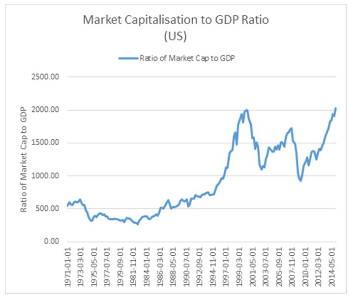
As shown below, the US sharemarket just hit an all-time high on this ratio, even surpassing the 2001 Tech Bubble levels.
Market Capitalisation to GDP Ratio, US, 1971-2015

Source: FRED
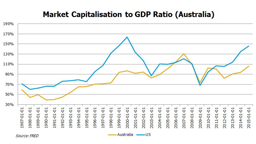
The same ratio for Australian equities shows far better value at home, albeit now above average levels by around 14%.
Market Capitalisation to GDP Ratio, 1987-2015
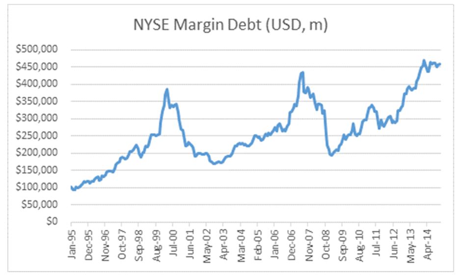
 3. Margin Debt level on NYSE
One other ratio that gets followed closely is margin debt, that is total amount of debt owing against shares on the NYSE. This has reached an all time high, although it should be noted that this outcome is without question linked to the very low interest rates in the US right now. For investors that believe that rates will jump in the US, there is about US$200bn of excess margin debt that would likely be removed in that scenario. That represents around US$600bn in selling pressure, which even for the US market is a lot to absorb. For those with a view that US rates will be lower for longer, this ratio is only really a concern for the implied “irrational exuberance”.

Source: NYSE
Copyright The contents of this document are copyright. Other than under the Copyright Act 1968 (Cth), no part of it may be reproduced or distributed to a third party without FIIG’s prior written permission other than to the recipient’s accountants, tax advisors and lawyers for the purpose of the recipient obtaining advice prior to making any investment decision. FIIG asserts all of its intellectual property rights in relation to this document and reserves its rights to prosecute for breaches of those rights.
Disclaimer Certain statements contained in the information may be statements of future expectations and other forward-looking statements. These statements involve subjective judgement and analysis and may be based on third party sources and are subject to significant known and unknown uncertainties, risks and contingencies outside the control of the company which may cause actual results to vary materially from those expressed or implied by these forward looking statements. Forward-looking statements contained in the information regarding past trends or activities should not be taken as a representation that such trends or activities will continue in the future. You should not place undue reliance on forward-looking statements, which speak only as of the date of this report. Opinions expressed are present opinions only and are subject to change without further notice.
No representation or warranty is given as to the accuracy or completeness of the information contained herein. There is no obligation to update, modify or amend the information or to otherwise notify the recipient if information, opinion, projection, forward-looking statement, forecast or estimate set forth herein, changes or subsequently becomes inaccurate.
FIIG shall not have any liability, contingent or otherwise, to any user of the information or to third parties, or any responsibility whatsoever, for the correctness, quality, accuracy, timeliness, pricing, reliability, performance or completeness of the information. In no event will FIIG be liable for any special, indirect, incidental or consequential damages which may be incurred or experienced on account of the user using information even if it has been advised of the possibility of such damages.
FIIG provides general financial product advice only. As a result, this document, and any information or advice, has been provided by FIIG without taking account of your objectives, financial situation and needs. Because of this, you should, before acting on any advice from FIIG, consider the appropriateness of the advice, having regard to your objectives, financial situation and needs. If this document, or any advice, relates to the acquisition, or possible acquisition, of a particular financial product, you should obtain a product disclosure statement relating to the product and consider the statement before making any decision about whether to acquire the product. Neither FIIG, nor any of its directors, authorised representatives, employees, or agents, makes any representation or warranty as to the reliability, accuracy, or completeness, of this document or any advice. Nor do they accept any liability or responsibility arising in any way (including negligence) for errors in, or omissions from, this document or advice. Any reference to credit ratings of companies, entities or financial products must only be relied upon by a ‘wholesale client’ as that term is defined in section 761G of the Corporations Act 2001 (Cth). FIIG strongly recommends that you seek independent accounting, financial, taxation, and legal advice, tailored to your specific objectives, financial situation or needs, prior to making any investment decision. FIIG does not make a market in the securities or products that may be referred to in this document. A copy of FIIG’s current Financial Services Guide is available at www.fiig.com.au/fsg.
An investment in notes or corporate bonds should not be compared to a bank deposit. Notes and corporate bonds have a greater risk of loss of some or all of an investor’s capital when compared to bank deposits. Past performance of any product described on any communication from FIIG is not a reliable indication of future performance. Forecasts contained in this document are predictive in character and based on assumptions such as a 2.5% p.a. assumed rate of inflation, foreign exchange rates or forward interest rate curves generally available at the time and no reliance should be placed on the accuracy of any forecast information. The actual results may differ substantially from the forecasts and are subject to change without further notice. FIIG is not licensed to provide foreign exchange hedging or deal in foreign exchange contracts services. The information in this document is strictly confidential. If you are not the intended recipient of the information contained in this document, you may not disclose or use the information in any way. No liability is accepted for any unauthorised use of the information contained in this document. FIIG is the owner of the copyright material in this document unless otherwise specified.
The FIIG research analyst certifies that any views expressed in this document accurately reflect their views about the companies and financial products referred to in this document and that their remuneration is not directly or indirectly related to the views of the research analyst. This document is not available for distribution outside Australia and New Zealand and may not be passed on to any third party without the prior written consent of FIIG. FIIG, its directors and employees and related parties may have an interest in the company and any securities issued by the company and earn fees or revenue in relation to dealing in those securities.